Homeroth: A Bold Display Font for Modern Web Design
As a UI designer who builds landing pages, SaaS dashboards, and e-commerce experiences, I choose fonts not just for aesthetics—but for behavior. How does a typeface guide the eye? Does it reinforce trust in a premium service? Can it scale cleanly across mobile headers, app buttons, and dark-mode banners? That’s why Homeroth stands out: it’s a display font engineered for impact without sacrificing digital clarity.
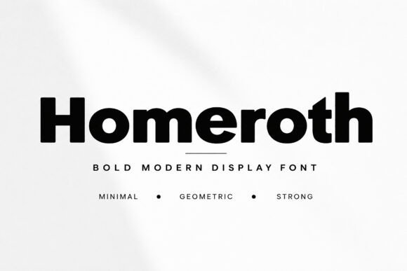
Homeroth is built on strong geometric shapes—tight curves, balanced proportions, and assertive stroke contrast. It’s not decorative for decoration’s sake. Every letterform is tuned for screen legibility at larger sizes, with open counters and generous spacing that prevent visual crowding on high-DPI displays. The result? A confident, contemporary aesthetic that feels intentional—not trendy—and scales predictably from 32px hero titles to 48px section headings on tablet layouts.
Where Homeroth Earns Its Place in Your Layout
Homeroth thrives where hierarchy matters most. Use it for:
- Hero section headlines—especially on product landing pages or course sales sites where first-impression authority drives conversion;
- CTA buttons and banner text—its weight and presence make “Get Started” or “Join Now” feel decisive, not generic;
- Branded content sections—think “Our Approach”, “What Sets Us Apart”, or “The Framework”—phrases that define tone and differentiate your offering;
- Portfolio site titles and project cards—it adds polish without competing with imagery;
- Online store banners and limited-edition drop announcements—its modern geometry pairs naturally with minimalist product photography.
It’s not ideal for body copy, long paragraphs, or small interface labels. Homeroth is a display font—designed to command attention, not sustain reading. That’s a strength, not a limitation. When used intentionally, it sharpens your layout’s rhythm and reinforces brand confidence.
Readability in Real Digital Contexts
On mobile, Homeroth performs best above 28px in portrait view. Below that, letterforms begin to lose their structural clarity—so reserve it for top-level headings only in responsive breakpoints. For dark backgrounds, use its default weight (not light or thin variants) and add subtle letter-spacing (0.5–1px) to maintain separation. On image overlays, ensure at least 70% opacity behind the text or apply a soft, non-distracting backdrop to preserve contrast.
Homeroth includes multiple weights—Regular, Bold, and often an ExtraBold—plus true italics and OpenType alternates. These aren’t just stylistic flourishes; they let you create nuanced hierarchy *within* headline families. For example, use Regular for section titles and Bold for subheadings—no need to switch fonts to signal importance.
Smart Pairing for Balanced Digital Typography
Homeroth pairs exceptionally well with clean, neutral sans serifs—think Inter, Manrope, or even system fonts like -apple-system or Segoe UI—for body text, captions, and interface labels. This pairing delivers contrast without tension: Homeroth brings personality; the sans serif delivers neutrality and readability. For editorial or creative brand sites, try it with a restrained serif like Literata or Lora—just avoid overly ornate serifs that clash with Homeroth’s geometry.
Avoid pairing Homeroth with other display fonts, script fonts, or handwritten styles unless you’re designing a single-purpose graphic (e.g., social media promo). In UI contexts, consistency beats variety. One strong display voice + one clear functional voice = stronger brand recognition and faster user scanning.
Practical Integration & Licensing
Homeroth is delivered as WOFF2 and WOFF webfont files—fully compatible with modern CSS @font-face declarations and CDN-based font hosting. Most versions include Latin-1 and extended Latin support, covering English, Spanish, French, German, Portuguese, and more—critical for global SaaS tools or multilingual online stores. Check the license before use: a standard commercial license covers websites, client projects, online shops, and digital templates, but extended licenses may be needed for white-labeled products or embedded apps.
If you're building reusable design systems or brand kits for clients, confirm whether Homeroth permits redistribution in Figma libraries or design tokens. Many foundries now include variable font options—check if Homeroth offers a variable axis for weight or width. That flexibility simplifies responsive typography management and reduces HTTP requests.
Real-World Use Cases That Work
For a boutique coaching website, Homeroth sets the tone in the hero headline (“Clarity Starts Here”) while Inter handles testimonials and program details—clean, human, and trustworthy. An indie online store selling ceramic goods uses Homeroth for seasonal collection banners (“Spring Edit”, “Studio Drop”) over muted background images—its geometry echoes the craftsmanship without shouting. A developer-focused tool uses Homeroth only in its marketing site’s feature grid headings (“Built for Scale”, “Zero Config”), letting its technical precision mirror the product’s promise.
Even in constrained environments—like a compact dashboard sidebar or a notification badge—Homeroth’s Bold weight at 16px with tight tracking reads clearly when used sparingly. It’s not about using it everywhere. It’s about using it where it changes how users perceive your brand’s competence and intentionality.
Typography is never neutral. Every font signals something—about speed, luxury, reliability, creativity, or authority. Homeroth communicates modern confidence without cliché. It doesn’t mimic trends—it supports them. And in web design, where milliseconds of attention and micro-decisions shape engagement, that kind of deliberate typographic intent isn’t optional. It’s foundational.