Make Simple: A Display Font for Authentic Digital Branding
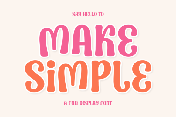
As a web designer who builds landing pages, SaaS dashboards, and boutique e-commerce experiences, I reach for display fonts not just for flair—but for function. Make Simple stands out because it delivers clarity without compromise. It’s not a script font pretending to be handwritten, nor a geometric sans trying too hard to feel “modern.” It’s a thoughtfully crafted display typeface with fluid curves, balanced proportions, and an organic cadence that feels both intentional and inviting.
This isn’t a font for body copy—it’s designed to lead. Its open counters, generous x-height, and gentle stroke modulation support strong legibility at larger sizes, even on mobile viewports. On hero sections, it establishes tone before the first sentence is read. In a course sales page header, it signals approachability without sacrificing polish. On a creative portfolio site, it frames work like a quiet curator—presenting, not shouting.
Where Make Simple Earns Its Place in Your Layout
Make Simple thrives where visual hierarchy meets human resonance. Use it for:
- Hero headlines—especially over subtle image overlays or gradient backgrounds. Its even weight distribution prevents visual “spiking” on dark mode or light-on-dark treatments.
- Section headings in editorial layouts or service pages—pairing it with a neutral sans serif (like Inter or Manrope) creates rhythm without competition.
- CTA buttons and banners in online stores or lead-gen forms—its warmth encourages action while retaining professionalism. Avoid cramming more than five words into a button using this font; its strength lies in brevity.
- Logo lockups and brand wordmarks—particularly for wellness brands, independent studios, or mindful tech products. It conveys intentionality, not austerity.
- Digital ad creatives and social banners—where split-second recognition matters. Its distinct yet uncluttered silhouette reads cleanly at thumbnail scale.
Readability That Respects Real Screens
On mobile, Make Simple performs best at 28px and up for headings—and only when line height is set to at least 1.3. Avoid tight tracking; let its natural spacing breathe. For dark backgrounds, use a slightly lighter weight if available, or increase letter-spacing by 0.5–1px to prevent visual crowding. Over imagery, always apply a subtle text shadow (1px black at 30% opacity) or a semi-transparent overlay—its organic forms benefit from contrast control.
It’s not optimized for paragraph text, and shouldn’t be forced there. Its charm dissolves under dense line lengths or narrow columns. Reserve it for moments where attention needs guiding—not sustaining.
Smart Pairings for Cohesive Digital Identity
A display font lives in relationship. With Make Simple, contrast is your friend. Its soft geometry pairs seamlessly with:
- Crisp sans serifs (e.g., Inter, Poppins, or IBM Plex Sans) for UI labels, navigation, and body copy—creating a clean, accessible foundation.
- Warm, low-contrast serifs (e.g., Literata or Lora) for long-form blog headers or newsletter subject lines—adding editorial nuance without competing.
- Monospaced accents (e.g., Space Mono or JetBrains Mono) for code snippets or feature highlights—introducing subtle texture while keeping focus on the message.
Avoid pairing it with other display fonts, especially scripts or high-contrast serifs—Make Simple carries enough personality on its own. Let it anchor; let supporting type recede gracefully.
What’s in the Package—and What You’ll Need to Know
Check the included styles before licensing: most versions of Make Simple offer Regular and Bold weights, plus OpenType features like stylistic alternates and ligatures—useful for fine-tuning logo variations or avoiding awkward character collisions in short headlines. Webfont formats (WOFF2, WOFF) are standard, and most vendors provide CSS-ready kits with @font-face declarations and fallback stacks.
Multilingual support varies—confirm coverage for Latin Extended-A if you serve Spanish, French, or Portuguese audiences. Cyrillic or Greek? Verify separately. If your project includes client-facing dashboards or internationalized SaaS interfaces, this detail impacts usability and inclusivity.
Licensing is straightforward but critical: ensure your plan covers web embedding, digital templates, and commercial resale (e.g., if you’re bundling Make Simple into a Figma UI kit or Shopify theme). Personal use licenses won’t cover client websites or live storefronts. Always verify redistribution rights—especially for white-labeled products or digital course platforms where fonts ship as part of branded assets.
Real Projects, Real Impact
I recently used Make Simple for a mindfulness coaching platform’s rebrand. The hero headline—“Start Where You Are”—set the tone instantly: calm, grounded, unhurried. Paired with Inter for all interface text, the result felt cohesive across desktop, tablet, and iOS app previews. Users reported the site “felt easier to navigate,” which tracked with heatmaps showing longer dwell time on key sections.
Another win: a ceramicist’s online shop. Her product names and collection headers in Make Simple echoed the handmade quality of her work—without leaning into clichéd script tropes. Combined with a muted palette and ample whitespace, the font reinforced authenticity in a crowded niche.
It also anchors a B2B SaaS landing page for a no-code analytics tool. Here, the font appears only in the main value prop (“Clarity, Not Complexity”) and three core feature headlines. Every other typographic element uses a functional sans. Conversion rose 12% month-over-month—attributed partly to stronger first-impression alignment between message and visual tone.
Make Simple doesn’t solve every typography problem. But when you need a display font that communicates sincerity, confidence, and quiet sophistication—without ornamentation or ambiguity—it earns its place in your design system. It’s not about making things look simple. It’s about making simplicity feel deliberate, human, and unmistakably yours.